
AI와 데이터 사이언스의 이론과 실전
CSS - 반응형 웹, 미디어 쿼리(모바일 버전, 태블릿 버전, pc버전) 본문
1. 반응형 웹이란?
반응형 웹 (Responsive Web Design) 이란 하나의 웹사이트에서 pc,스마트폰,태블릿 등 접속하는 디스플레이에 따라서 화면의 크기가 자동으로 변하도록 만든 웹페이지 접근방법입니다. 반응형 웹은 웹 페이지의 구조, 레이아웃, 컨텐츠 및 디자인을 유연하게 만들어 다양한 디바이스에서 일관된 사용자 경험을 제공합니다. 이는 그리드 시스템, 유동적 이미지, 폰트 크기 조절 등 다양한 기술을 포함합니다.
2. 미디어 쿼리 (Media Query)
미디어 쿼리는 반응형 웹 디자인을 구현하기 위한 기술 중 하나입니다. 이는 CSS3의 기능으로, 화면 너비, 해상도, 뷰포트 방향 및 기타 미디어 특성에 따라 스타일을 동적으로 조절하는 데 사용됩니다. 미디어 쿼리는 반응형 웹 디자인의 일부로, 다양한 디바이스에서 웹 페이지를 최적화하는 데 중요한 역할을 합니다.
@media 매체유형(all/creen/...) and 속성에대한조건(대부분 해상도){css 코드}< 예시 코드 >
PC가 아닌 경우에는 배경 컬러가 yellow이고 PC인 경우 배경 컬러가 deepskyblue인
<!DOCTYPE html>
<html lang="en">
<head>
    <meta charset="UTF-8">
    <meta name="viewport" content="width=device-width, initial-scale=1.0">
    <title>미디어쿼리1</title>
    <style>
        body { background-color: yellow;}
        @media screen and (min-width:1024px) {
            body { background-color: deepskyblue;}

        }
    </style>
</head>
<body>
    <h2>미디어쿼리1</h2>
</body>
</html>
< 예시코드>
[HTML]
<!DOCTYPE html>
<html lang="en">
<head>
<meta charset="UTF-8">
<meta name="viewport" content="width=device-width, initial-scale=1.0">
<title>미디어쿼리2</title>
<link rel="stylesheet" href="./css/media.css">
</head>
<body>
<div id="container">
<header>
<nav>
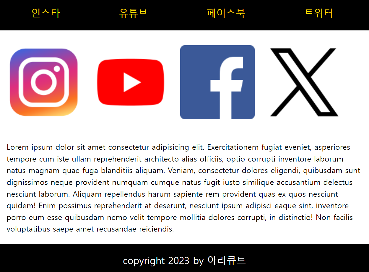
<ul>
<li>인스타</li>
<li>유튜브</li>
<li>페이스북</li>
<li>트위터</li>
</ul>
</nav>
</header>
<div id="contents">
<section id="intro">
<img src="./images/instagram.png" alt="인스타">
<img src="./images/youtube.png" alt="유튜브">
<img src="./images/facebook.png" alt="페이스북">
<img src="./images/twitter.png" alt="페트위터이스북">
</section>
<section id="desc" class="text">
<p>Lorem ipsum dolor sit amet consectetur adipisicing elit. Exercitationem fugiat eveniet, asperiores tempore cum iste ullam reprehenderit architecto alias officiis, optio corrupti inventore laborum natus magnam quae fuga blanditiis aliquam. Veniam, consectetur dolores eligendi, quibusdam sunt dignissimos neque provident numquam cumque natus fugit iusto similique accusantium delectus nesciunt laborum. Aliquam repellendus harum sapiente rem provident quas ex quos nesciunt quidem! Enim possimus reprehenderit at deserunt, nesciunt ipsum adipisci eaque sint, inventore porro eum esse quibusdam nemo velit tempore mollitia dolores corrupti, in distinctio! Non facilis voluptatibus saepe amet recusandae reiciendis.</p>
</section>
</div>
<footer>
<p>copyright 2023 by 아리큐트</p>
</footer>
</div>
</body>
</html>[CSS]
* {
    margin: 0;
    padding: 0;
    box-sizing: border-box;
}

header{
    width: 100%; /*모바일은 무조건  가로에 맞출거니 100%*/
    background-color: black;
    margin-bottom: 20px;
}

nav>ul{
    height: 50px;
    list-style: none;
    color: gold;
}

nav > ul > li {
    float: left;
    padding: 10px;
    margin: 5px;
}

nav, #contents {
    width: 320px;
    margin: 0 auto;
}

nav > ul {
    font-size: 12px;
}

#intro {
    width: 100%; /*나중에 늘어나도 같이 늘도록 설정*/
    margin-bottom: 20px;
}

#intro > img {
    width: 100%;
    padding: 10px;
}

#desc {
    width: 100%;
    padding: 10px;
    line-height: 1.5;
}

footer {
    width: 100%;
    height: 50px;
    padding: 10px;
    background-color: black;
    color: white;
    text-align: center;
    font-size: 16px;
    line-height: 25px;
}

@media screen and (min-width : 768px) {
    nav > ul {
        font-size: 20px;
        height: 80px;
    }

    nav > ul > li {
        margin: 20px 50px;
    }

    nav, #contents {
        width: 750px;
        margin: 0 auto;
    }

    #intro{
        width: 100%;
    }

    #intro > img {
        width: 23%;
        padding: 10px;
    }

    #desc{
        width: 100%;
        padding: 10px;
        margin: 10px auto;
    }

    footer{
        height: 70px;
        padding: 10px;
    }

    footer > p {
        font-size: 20px;
        line-height: 45px;
    }
}

@media screen and (min-width : 1024px) {
    nav, #contents{
        width: 1000px;
        margin: 0 auto;
    }

    #intro > img {
        width: 10%;
        padding: 10px;
        float: left;
        margin-right: 20px;

    }

    #desc {
        /* display: inline-block;
        width: 400px; 글자를 오른쪽에만 넣을때*/
        height: auto;
        font-size: 20px;
        padding: 10px;
    }
    footer {
        clear: both;
    }

}
< 결과 >
모바일, 태블릿, PC 모두 다르게 나옴

3. 매체유형
- all : 모든매체
- screen : 컴퓨터 태블릿 스마트폰
- print : 프린터(출력시)
- speech : 스크린 리더
4. 구분 기준
PC, 태블릿, 모바일은 해상도를 기준으로 구분합니다.
- 핸드폰
- 해상도가 굉장히 높기때문에 뷰포트를 써서 해상도를 줄임
- 구형폰 : 320px
- 일반폰 : 360px 이상
- 때문에 320정도에 맞춰서 생성 - 태블릿 : 768px이상
- 테스크탑 : 1024px 이상
4. em과 rem
em과 rem은 CSS에서 폰트 크기를 상대적으로 지정하는 단위입니다. 이러한 단위는 웹 디자인에서 텍스트의 크기를 조절할 때 사용됩니다.
4.1. em
em은 부모요소 크기의 몇 배인지 단위로 설정, 부모의 크기를 상속받아 사용하는 단위입니다.
- pc의 1em = 16px(브라우저 기본값,pc의 일반 텍스트 크기)
모바일의 1em = 12px(브라우저 기본값, 모바일의 일반 텍스트 크기)
| pc의 예) [HTML] </div id = 'hello'>
안녕하세요 [CSS] #hello { font-size: 2em} |
4.2. rem
rem은 문서의 최상위 요소(HTML)의 몇 배인지를 크기로 설정합니다.
| pc의 예) [HTML] <html> <body id = 'hello'> <div>안녕하세요</div> </body> </html> [CSS] html { font-size: 2rem} <!-- 글자의 크기가 모두 2rem(32px)로 적용--> |
'HTML과 CSS > CSS' 카테고리의 다른 글
| CSS - 2D 효과 추가(Transform, Transition) (0) | 2023.10.25 |
|---|---|
| CSS - 우선순위 (0) | 2023.10.24 |
| CSS - 수평 배치(float, flex), 겹쳐서 출력 (1) | 2023.10.22 |
| CSS - 위치지정(static, relative, fixed, sticky, absolute) (1) | 2023.10.21 |
| CSS - display 속성, 폼 태그 (1) | 2023.10.20 |


